The death of the line of death
The line of death, as Eric Lawrence explained in a classic blog post, is the idea that an application should separate trustworthy UI from untrusted content. The typical example is in a web browser, where untrustworthy web content appears below the browser toolbar UI. Trustworthy content provided by the web browser must appear either in the browser toolbar, or anchored to it or overlapping it. If this separation is maintained, then untrusted content can’t spoof the trustworthy browser UI to trick or attack the user.
Though the line of death has been an axiom of browser security for years, it’s losing relevance in modern browsers, and fortunately being replaced by more effective patterns for some attacks.
The line of death principle is a bit antiquated. First of all, I’m not aware of any research to support that it’s effective. In fact I’m not aware of much research about it at all. There’s plenty of research and practical experience to show that phishing is effective, picture-in-picture attacks are effective, and security indicators in the URL bar are misunderstood. There’s also some research on operating system equivalents to the line of death (thanks to Stuart Schechter for the pointer). But I’m not aware of any research that focuses on the line of death concept in browsers specifically. For example, I’d like to see a study looking at whether users perceive a dialog anchored to the browser toolbar differently than an identical dialog shown by web content. (Please send me pointers!) In the absence of usability studies, my intuition is that the line of death is simply a foreign, incomprehensible idea to many, many browser users.
In the aforementioned blog post, Eric Lawrence outlines many of the reasons that the line of death is not a particularly user-friendly concept. For one, it’s subtle; many browser UIs distinguish browser UI solely by a few pixels of overlap between the UI element and the browser toolbar. It’s also inconsistent; for example, mobile browsers don’t have a line of death but instead sometimes (but not always) differentiate browser UI by graying out everything behind it. And, even in desktop browsers, the area above the line of death contains some untrusted content.
Blurring the lines
I’ll add one more reason that the line of death is not a very comprehensible security boundary: browser and web functionality has exploded in recent years, further eroding the concept of a clean separation between trustworthy system UI and untrusted content. Here are two examples:
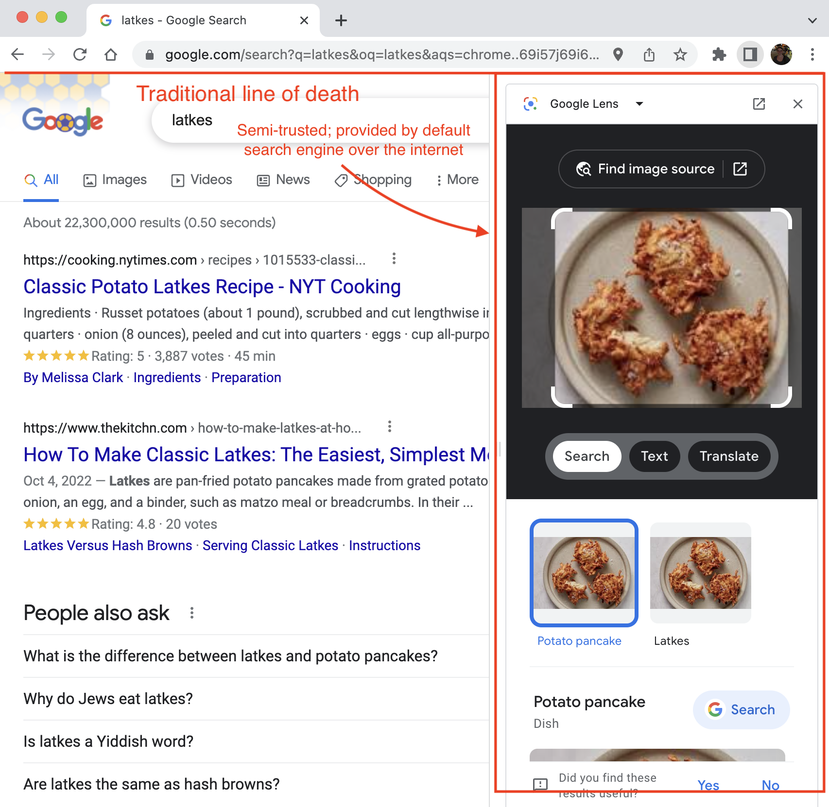
Side panel
Chrome (and maybe other browsers?) now has a side panel, which loads content from the default search engine anchored to the browser UI but below the line of death. Is the side panel trusted system UI or untrustworthy web content? It’s hard to say. Even if you consider the default search engine completely trustworthy, do you trust a regular TLS connection to serve what could be construed as trusted browser UI? (Chromium does, but it’s not a simple question.)
Embedded browser windows
New web platform features have introduced new modalities for displaying web content. For example, the Payment Handler API introduced a new type of embedded browser window for completing payment flows.
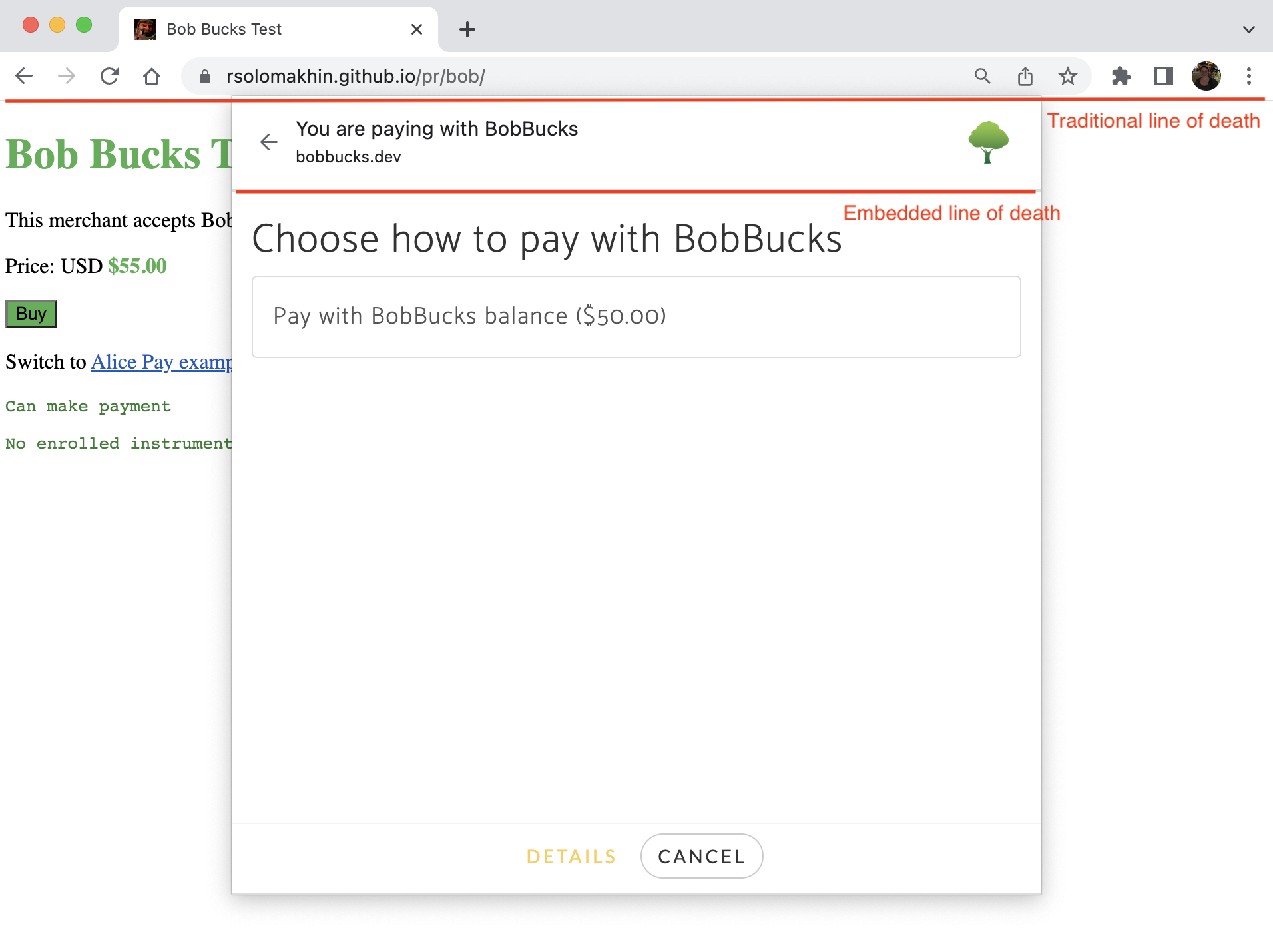
This flow mixes UI from two different web origins – a merchant site in a normal browser tab, and a payment handler site in a special type of embedded browser window that is anchored to the browser UI. The embedded browser window has its own line of death, with browser-controlled UI above it (“You are paying with BobBucks”) and untrusted web content below it.
There were good reasons for introducing this new embedded browser UX, but still, good luck explaining to any non-technical user what they should or should not trust in this screenshot.
These are just two of many examples of expanded web and browser features that have blurred the line between browser UI and untrusted web content. For this reason as well as all the other reasons that Eric Lawrence described, I think the web security community should try to avoid relying on the line of death whenever possible.
The new hotness
There are some attacks in which the line of death concept is really the best we know how to do. It’s fundamentally impossible to have a secure application environment without some trustworthy UI. But fortunately, security UX has advanced quite a bit since web browsers were invented, and there are now a number of trendy concepts that are far more secure and, in some situations, reduce our reliance on users’ understanding of the line of death.
Negative security indicators, not positive
Browsers, or other applications displaying untrusted content, should warn users when there is a security problem, rather than trying to affirm to users that everything is fine. Negative security indicators are a better usable security pattern than positive indicators for many reasons. One of these reasons is that untrusted content doesn’t usually have much of an incentive to spoof a negative indicator. It is therefore less critical that we rely on a concept like the line of death to help users differentiate trustworthy security indicators from spoofed ones – the attacker gains nothing from spoofing them.
For example, consider the padlock icon that browsers show to indicate a TLS connection. An attacker may want to spoof this icon on their untrustworthy website to lull the user into a false sense of security. But if the browser never showed a positive icon for connection security and only warned the user when the connection was not encrypted, the problem of trying to help users differentiate a trustworthy padlock icon from a spoofed one disappears.
For the sake of completeness, I’ll note that it’s not strictly true that an attacker never has an incentive to spoof a negative indicator. For example, tech support scams might spoof certificate or Safe Browsing warnings to try to convince the user that their computer is broken and induce them to call a fake tech support phone number that charges them for fraudulent services. However, overall I argue that positive security indicators make for much more attractive spoofing targets than negative.
Unphishable credentials
One of the major motivations for the line of death concept is phishing. However, phishing seems to be an endlessly effective attack, unhindered by the concept of trustworthy browser UI telling users which website they are actually visiting.
Hopefully, passwords are dying a slow death, to be replaced by unphishable credentials through, for example, the WebAuthn specification. Once credentials are established, the WebAuthn security model does not rely on the user distinguishing trustworthy UI from untrusted content.
This pattern is expanding outside of passwords, too. The Secure Payment Confirmation specification defines ways to use WebAuthn to ensure that payment instruments, like credit card numbers, can’t be used without the legitimate user’s authorization – with that authorization provided in an unphishable manner.
Of course, not all sensitive information can be made unphishable. For example, there is no way to safely provide your social security number to what you believe is the IRS website without using some trustworthy UI to distinguish whether you have ended up on the real IRS website rather than an impersonator. Theoretically, social security numbers could be replaced with unphishable public key credentials, but I’m not holding my breath. For now, it’s a huge advance that websites are able to authenticate users without relying on phishable passwords and users’ ability to detect spoofs.
Application-level content moderation
Finally, I think that application-level content moderation has a role to play in reducing confusion between browser UI and untrustworthy web content.
Consider how a user might typically end up on a malicious website. Maybe they get a phishing email and click a link to a fake bank website. Or maybe they open their favorite social media app on their phone and, following a post from a friend, end up on a misinformation website. Or maybe they do a web search for a product they want to buy and follow a link to a fraudulent merchant website.
In all these examples, there is a content moderation role to be played at the top of the funnel: the email provider can do anti-phishing screening, the social media network can flag misinformation, the search engine can provide high-quality results. Of course these are not easy tasks, by any means – but they are merely extremely difficult abuse prevention problems, not extremely difficult abuse prevention problems combined with extremely difficult security UI problems.
Of course, many web browsers have highly effective abuse mitigation mechanisms too, such as showing full-page warnings on known phishing pages. But when abuse prevention goes beyond showing strong negative warnings to providing more nuanced context around content, it becomes harder for the browser security UI to play a role. The fundamental job of displaying untrusted content does not coexist well with displaying nuanced context and functionality around that content in a trustworthy manner. Browser vendors should by no means abdicate the role of abuse prevention, but they should perhaps seek to play it with UI that does not present an incentive for spoofing. This approach will reduce the need for users to understand the complex, eroded line of death concept to get context about the content they are viewing.
Thanks to Jon Callas, Nick Doty, Eric Hellman, Chris Palmer, and others for feedback on this post.