Debunking the "users always click yes" myth
There’s a common myth among software engineers, and security engineers in particular, that people will always click “yes” on any warning or prompt, blindly accepting any risk about which the UI warns. This is not generally true, and the misconception can lead to suboptimal design decisions and even security nihilism.
Warnings can be designed for adherence
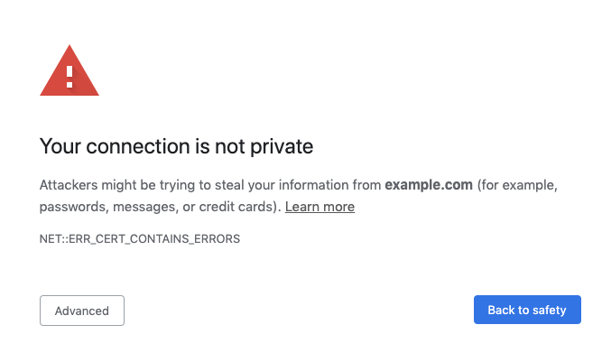
Warning adherence is the percentage of users who do what a warning wants them to do. For example, we say that users adhere to an SSL certificate warning if they leave the offending site upon encountering the warning.
Design decisions can influence adherence significantly – for example, redesigning the Chrome SSL warning increased adherence from 37% to 62%. (Today, SSL warning adherence is even higher, at around 80% on Windows. One possible explanation is that we got rid of many false positive SSL errors, thereby leaving more real errors that users don’t want to bypass, but I don’t know for sure.) Example of visual or interaction adherence cues include highlighting the “safe” button or hiding the “unsafe” button behind a dropdown.

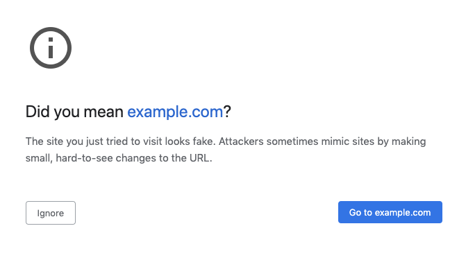
Some warnings may not need to be as extremely opinionated as the SSL certificate warning to achieve good adherence. For example, Chrome has a warning for lookalike domains that use unusual characters to create convincing spoofing domains. This warning, shown below, is designed to be less opinionated and makes it easier for people to find the unsafe option, yet people choose the unsafe option <15% of the time.

It can also be useful to measure user behaviors other than adherence. People may choose the unsafe option on a warning, but then act more cautiously as they proceed (for example, by not entering passwords on the unsafe site). Depending on the risk in question, this may or may not be a safe behavior. My team has some recent data on this phenomenon that I hope we’ll be able to share publicly soon.
There are some caveats to this approach of designing warnings for adherence:
- In the study I linked above, the redesigned warning did not improve comprehension. People made safer decisions with the redesigned warning, but they didn’t understand the warning better than before. Convincing people to make safe choices may be easier than helping them understand the risks, especially in light of follow-up research suggesting that there is no single easily-surmountable challenge that gets in the way of comprehensibility.
- Designing for adherence can be seen as a spectrum. On one end of the spectrum might be an obfuscated password for bypassing the warning. This end of the spectrum could be seen as paternalistic, or as favoring expert users and denying non-expert users the same functionality. On the other end might be placing the safe and unsafe options on equal footing with no visual or interaction distinctions. This end of the spectrum lets people make their own uninfluenced choices, but puts them at risk if they do not comprehend the warning well. I think that choosing a point on this spectrum is probably a subjective, qualitative product decision, but it’s important to know that the spectrum exists.
Prompts that aren’t warnings
One might concede that warnings can achieve good adherence, but still speculate that users will always say “yes” to a prompt – a neutral question that doesn’t have any particular desired outcome.
I’m less familiar with the research in this area, and there may in fact be less research overall. But, one public data source we have is the Chrome User Experience Report, which recently added permission acceptance data for the web notification permission prompt. This data suggests that users neither blindly accept nor deny notification permission prompts. To pick a few examples that come to mind, users accept ~3% of notification prompts on www.tomshardware.com, ~22% on www.facebook.com, and ~82% on news.google.com (as of early 2020). These numbers are not apples-to-apples comparisons; many factors, including the audience and context of the website, will influence the acceptance rate. However, I do think these numbers suggest that users do not have a constant uniform reaction to permission prompts.
Update July 22, 2020: Bram Bonné pointed me to a study where nearly half of participants had denied an Android permission prompt at least once in a 6 week period.
So what does this mean?
Developers shouldn’t assume that users will always blindly say “yes” to any security or privacy warning or prompt. We can design warnings to achieve good adherence, and even neutral prompts elicit neither a single uniform response nor a random response. Still, I think of it as good practice to avoid overloading people with security and privacy decisions, especially when the risks may not be comprehensible. I also think it can become unmaintainable to expose every security decision in the UI; software designers need to prioritize which choices to expose, and users should choose the software that gives the right level of control for them.